

Against the METR graph
METR’s benchmark has become a bellwether of AI capability growth, but its design isn’t up to the task, argues Nathan Witkin
This is an edited version of a post which first appeared on Arachne.
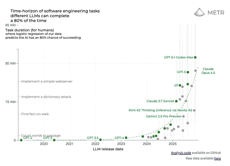
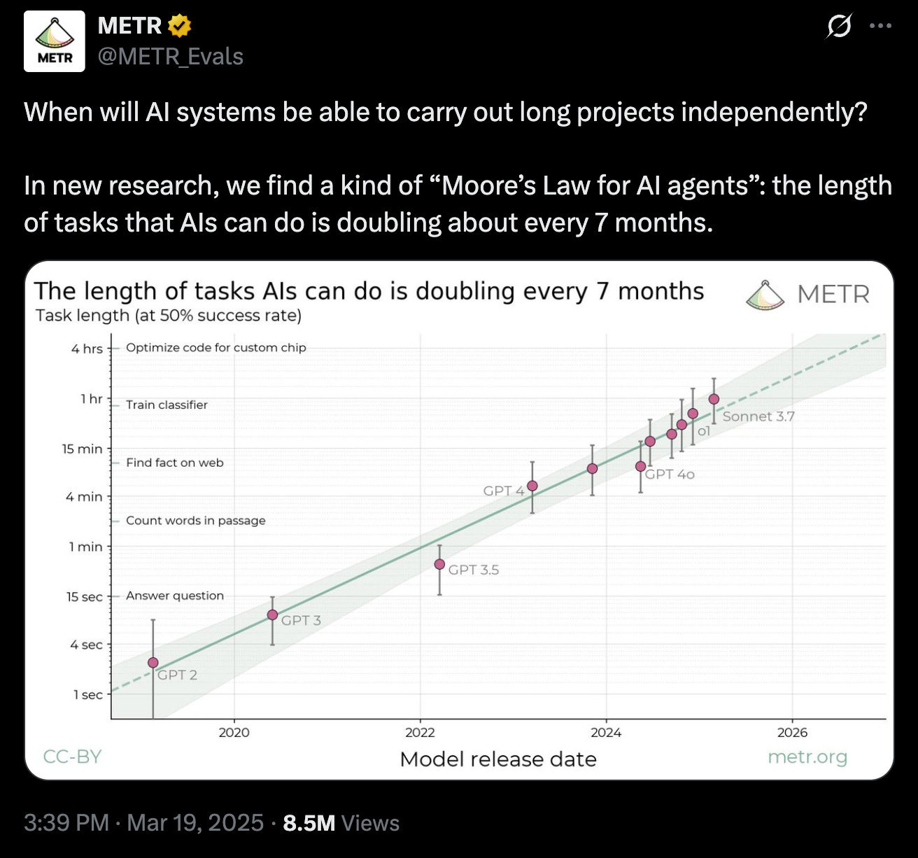
If you have been following AI over the last couple of years, you’ve probably encountered one or both of these graphs.
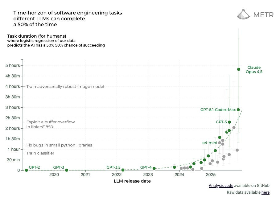
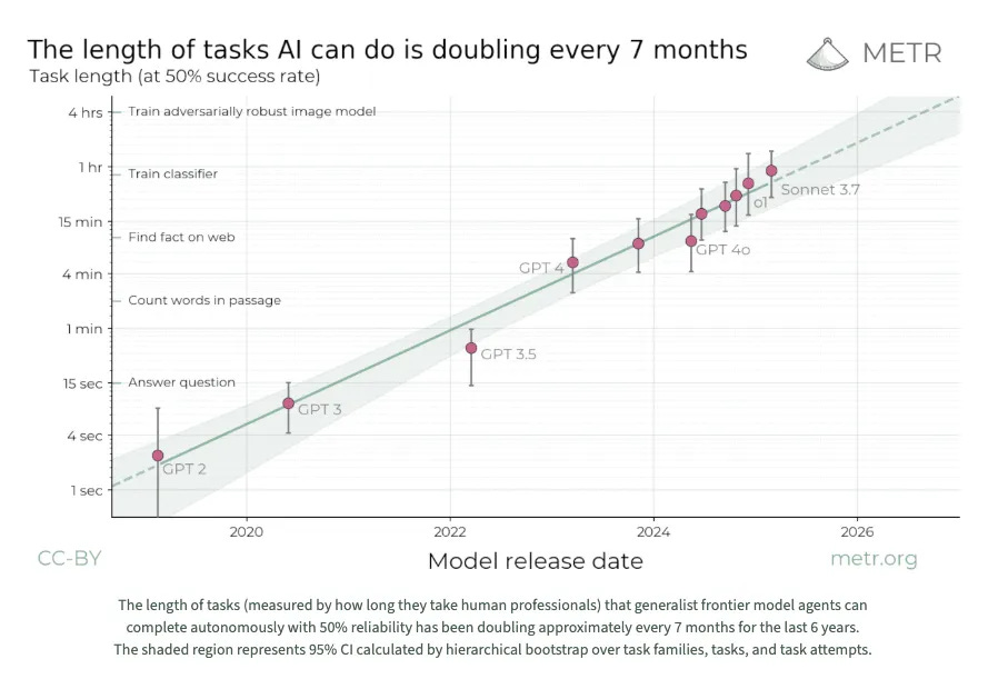
They come from the “Measuring AI Ability to Complete Long Tasks” benchmark created by non-profit AI research institute METR, which is seen as a critical bellwether of AI capability growth. The Long Tasks benchmark measures improvements in the ability of AI models to complete software engineering tasks compared to how long those tasks take humans.
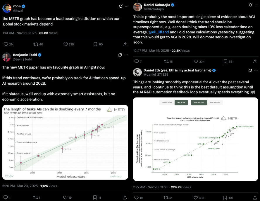
The AI Futures Project (the team responsible for AI 2027) recently called it “the best benchmark currently available for extrapolating to very capable AIs.” In a 2025 letter, Google DeepMind Engineer Zhengdong Wang described METR’s benchmark as “many people’s first introduction to the case that AI will be a big deal.” Screenshots of what is often simply called the “the METR graph” have been posted and reposted to death on X by researchers, engineers and businesspeople. Publications covering AI, including Transformer, also regularly cite it.
The subtext (or often simply the text) of these posts is that AI models are improving so rapidly that they may soon replace a large proportion of human knowledge-workers, not to mention pose a wide variety of serious, even existential risks to our wellbeing. Alternatively, they could usher in a utopia of economy-wide automation, freeing humans from the yoke of necessary labor, and bringing about a world of once-unimaginable material abundance.
Regardless of whether these scenarios strike you as ominous or ludicrous, METR’s Long Tasks benchmark tells us almost nothing about whether they might occur. In fact, it is hard to articulate what of substance it tells us at all. For all its discourse-shaping power, METR’s benchmark is ridden with methodological shortcomings, ranging from testing models against contrived, unrealistic software engineering tasks — something its authors have, to their credit, been upfront about — to staking their results on an exceedingly small, biased sample of their peers — something they have been less upfront about. Its memetic energy is a concerning sign of how easily flawed research can win even expert assent, so long as it provides a sheen of rigor to a widely accepted narrative.
1. Task unrealism
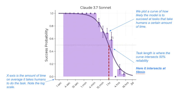
The y-axis of the METR graph plots the length of time it takes humans to carry out software engineering tasks that models can successfully complete 50% of the time (see the two graphs above). These times are found by measuring models’ average success rates per task, and using a logistic curve to identify the time horizon at which they cross the 50% success point.
METR has also published figures replacing 50% with 80% success rates. While models’ rate of improvement is similar, the scale of that improvement is much more modest (note the times on the y-axis).
Even the 80% figures, though, risk being overinterpreted. That is because, as METR acknowledges, many of the tasks it tested models and human baseliners on are extremely unrealistic. To their credit, the authors of METR’s Long Tasks preprint outline five “systematic differences” between their tasks and real tasks.
Automatic scoring: All tasks we use are automatically scorable … This imposes constraints on e.g. the format of solutions, that tend to reduce task open-endedness, and the need for sensible value judgments.
No interaction with other agents: None of our tasks involve interacting with other autonomous agents. Coordinating with, or competing with, other agents seems likely to increase task difficulty ...
Lax resource constraints: None of our SWAA tasks, and few of our HCAST tasks saliently involve making efficient use of a limited resource—a common constraint in real-world tasks.
Unpunishing: Similarly, very few of our tasks are punishing of single mistakes. This is in part to reduce the expected cost of collecting human baselines. Real world tasks can often be more punishing, for instance, when they involve competing against other agents ...
Static environments: Our tasks typically use environments that do not significantly change unless directly acted upon by the agent. In contrast, real tasks often occur in the context of a changing environment.
Beyond identifying these differences in an informal manner, the authors also break them down into 16 distinct “messiness factors,” and use them to assign “messiness scores” to all tasks that take humans a minute or longer to complete. They explicitly describe these messiness factors as “captur[ing] some systematic differences between our tasks and hard ‘real-world’ tasks”. They then plot AI model performance on the messiest versus least messy 50% of tasks. Below is a graph of models’ performance on the messiest 50% of tasks:
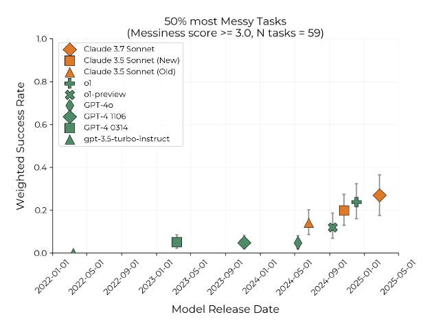
Not a single model topped a success rate of 30% for the messiest — that is, the most realistic — half of tasks. Given the authors’ acknowledgment that these tasks better represent real work done by software engineers, there is a strong case to be made that this graph ought to be considered METR’s topline result. Of course, if it had been publicized instead of METR’s original figures, the Long Tasks benchmark would not have had the impact that it did.
2. HCAST
These issues with task realism pale in significance, though, to several that are more specific to what METR calls its “HCAST” dataset.
This is a set of software engineering tasks that take human software engineers between roughly one minute and 30 hours. Out of the 170 tasks in METR’s task-suite, 97 come from HCAST. The rest come from SWAA Suite, which contains 66 single-step tasks taking humans between one and 30 seconds, and RE-Bench which contains seven complex AI R&D tasks taking humans at least eight hours. This means that the vast majority of the data points on the METR graph are HCAST tasks, since all but a couple fall in the one minute to five hours range.
The first thing to know about HCAST is that, as METR itself acknowledges, around 34% of its underlying tasks have public solutions, meaning that they are almost certainly a part of frontier models’ training data. It is unclear how much of this 34%, a total of 64 tasks, made it into the subset of 97 used in METR’s benchmark.
It is possible to get a rough sense by cross-checking the task families that made it into the Long Tasks benchmark with the degree of ‘contamination risk’ assigned to each family identified in the original HCAST paper . These task families group together tasks that all have the same basic structure. For example, one family is “wikipedia__research” — tasks which require models to “research simple factual information from Wikipedia and provide accurate answers to straightforward questions.”

I was able to use METR’s GitHub repository to confirm 35 of the 46 families that made it into the Long Tasks benchmark. Of these 35, eleven are identified as being made up of tasks with public solutions, and another ten are listed as being made up of tasks that are themselves public, even though their solutions aren’t.
That suggests that almost two thirds of the HCAST tasks used in the Long Tasks benchmark pose contamination risks of some kind, and around one third have solutions that can be found in models’ training data.
This not only would have inflated models’ performance, but done so unevenly, increasing performance on some tasks without doing so for others. This greatly increases the uncertainty around how to interpret METR’s results. If models have simply memorized the solutions (or parts of them) for a large share of tasks, then there is no way to know whether success is indicative of genuine capability growth.
Even this, though, amounts to a minor problem for METR in relative terms. Much more concerning are the methods the HCAST team used to collect human task completion time baselines. These are the values that make up the METR graph’s y-axis; if they are severely compromised, so is the entire benchmark.
The HCAST team recruited engineers who “typically” had more than three years of experience or a degree from a top 100 global university “primarily .. via the professional network of METR employees.” They assigned them to complete an average of around four tasks each; there were 140 engineers providing baselines, and 563 task attempts. For the Long Tasks benchmark, METR only ended up using 97 of these tasks, and 286 (successful) baselines. Presumably, this means they ended up with around three baselines per task, many of which were completed by the same individuals (more realistically, easier tasks probably had more completions, and harder tasks fewer).
Notably, those completing baselines were also paid “$50-$100 per hour, plus $25-$150 per hour in performance bonuses for completing tasks quickly and successfully.” One bonus, conditional on successful task completion, was half the hourly rate multiplied by the average time spent on the task by all baseliners, and another, conditional on completing a given task faster than all other baseliners, was the full hourly rate multiplied by this same average.

Taking stock of just these details: task completion times were recorded from not just a clearly biased sample of people within METR’s orbit, but an extremely small one. One cannot generalize the average task completion times of all software engineers (much less all humans) from around three people per task, all recruited from the same social network. This is unscientific in the extreme. Low-powered, highly-biased generalizations of this kind are precisely what standard sampling practices in the social sciences are meant to prevent.
Not only this, but baseliners were paid by the hour — the longer they took to complete tasks, the more money they made. Think for a second about how bizarre this is. If you are measuring the duration of a certain set of behaviors in a sample — and you want that measurement to have some external validity — the worst thing you can do is to pay your participants an hourly rate. It would be one thing if the target population were paid hourly for those behaviors ‘in the wild,’ but the vast majority of full-time software engineers are salaried.
While METR did try to incentivize faster completion times with bonuses, the prospect of receiving them was both uncertain and unlikely. Only the fastest baseliner on each task received a bonus for speed, meaning that, for the average baseliner, it still would’ve made financial sense to go slower, not faster. As a result, it at the very least seems likely that the HCAST team’s incentive system increased completion times relative to other possible incentive designs.
Continue digging through the HCAST and METR Long Tasks preprints, though, and the mere prospect of baseline inflation becomes a certainty. There is an entire section in the HCAST preprint titled “challenges with interpreting human baseline results.” Not a single one of the criticisms above makes an appearance. A few that do, to the authors’ credit, are that baseliners “had little to no outside context or prior experience on the tasks” they were assigned, and also “sometimes encounter[ed] tasks only loosely aligned with their .. expertise, potentially reducing their observed performance relative to typical professional work scenarios.”
To get a sense of how this might have impacted results, consider this pair of remarkable admissions from the appendix of METR’s Long Tasks preprint:
We manually watched and annotated the recordings of 50 baselines to get a sense of how our baseliners spent their time. Based on this small survey of baselines:
1. On short (5-15 minute) tasks, a substantial fraction of the time (between 25–75%) is spent reading instructions or understanding how to submit correctly. Particularly for short tasks, our time estimates may be hard to interpret as there is some fixed overhead for reading the instructions, independent of the difficulty of actually performing the task per se.
2. Our tasks are designed to require relatively low amounts of context but baseliners still spend over 25% of their time reminding themselves of relevant information (e.g. how to do port forwarding).
This is strong evidence that METR’s human baselines are inflated. And it is not even the only piece of evidence to that effect in this appendix. METR also quietly tested frontier models on issues from their own codebase, and compared their solution-times to those of baseliners and — critically — their own software engineers. This data is informative because it gives us a rough sense of how the time taken to complete a task might differ between those with, versus without, the relevant expertise. Arguably, it makes more sense to assess AI models by the latter. In the words of the HCAST team “in the real world, people mostly attempt tasks they and their employer have very high confidence they will be successful at.” With that in mind, the following table is another very bad sign for the Long Tasks benchmark’s external validity:
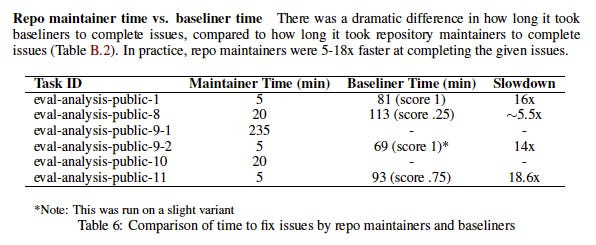
“In practice, repo maintainers [i.e. METR’s engineers] were 5-18x faster” than baseliners. At this point, we can be almost certain that METR’s baselines are inflated, possibly by quite a lot. That would in turn mean the model capabilities they report are inflated, since they are being evaluated by comparison to these baselines. It may be, for instance, that Opus 4.5 can (sometimes) complete a task that would take a typical HCAST baseliner five hours, but if that task would take an engineer with more relevant expertise only one hour, reporting the five hour figure as how long it takes “humans” to complete the task will mislead us as to Opus 4.5’s capacity to substitute for software engineering labor.
The human baselines used for METR’s Long Tasks benchmark are awful. They are based on an extremely small, non-representative sample, despite being described as task durations “for humans.” They are confounded by a bizarre incentive scheme in which participants were paid according to how much they increased the key value under study (i.e. task completion time). And to boot, baseliners had far less task-relevant expertise than would professional software engineers completing similar tasks at work. There is far too much noise for any genuine signal to break through here.
3. Doubling times and error bars
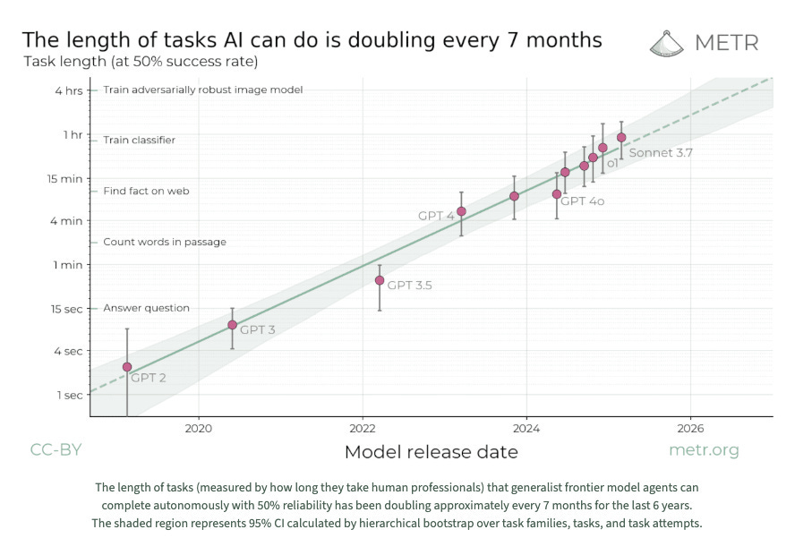
Since publishing an earlier version of this piece on my Substack, I have repeatedly heard a response along these lines: “okay fine, maybe METR’s baseline values are compromised. But they are all compromised in the same way. Therefore, at worst, the scale of the METR graph’s y-axis may change, but the overall speed of AI capability growth will remain the same.” METR makes a similar point in their preprint: “even if the absolute measurements are off by a factor of 10, the trend predicts that in under a decade we will see AI agents that can independently complete a large fraction of software tasks that currently take humans days or weeks.” Given that the trend, not the actual time-horizons, is generally the main thing emphasized by those who point to the graph, my critiques thus aren’t as serious as they appear — so the argument goes.
What this response misses is that the problems with METR’s HCAST dataset threaten not just the reliability of individual baseline values, but also the reliability of their distribution. Put differently, it is not true that METR’s baseline values “are all compromised in the same way.” There are multiple lines of evidence suggesting the opposite.
HCAST’s data contamination issues mean that models’ performance on as many as two thirds of all tasks would have been biased upward, with a subset of those tasks affected more dramatically due to their solutions being present in training data.
Likewise, there is reason to think that the distribution of task completion times in METR’s small, biased sample differ in systematic ways from a prospectively larger, properly randomized one. METR’s own research suggests that their sample underrepresents domain experts relative to engineers that are experienced, but working outside of their speciality. If a larger, random sample corrected for this imbalance, that could have the effect of compressing METR’s distribution of task completion times, since, while very short tasks presumably have more stable floors, “long” tasks may turn out much shorter when tackled by engineers with pertinent expertise. This would in turn make the AI capability growth curve much shallower, lengthening what METR refers to as “doubling times” — how long it takes for the task completion times at which models achieve 50% success rates to double.
Another common response I heard was that the problems I identified were already accounted for in METR’s confidence intervals, represented by the shaded region surrounding the trendline below. Confidence intervals are a statistical method for representing uncertainty about the true value of a given data point. Given the modest width of the shaded region, even taking into account statistical uncertainties, it would appear that METR’s doubling time estimates are relatively robust.
This too is incorrect. METR’s confidence intervals were calculated after task completion times had already been fixed. They represent the sensitivity of models’ performance to thousands of minor “resamplings” of the task set, in other words to small changes like dropping or duplicating individual tasks. They in no way represent uncertainty about METR’s human baseline times; confidence intervals for those were never calculated. Given how few baselines METR got per task, though, we can be confident that they would be enormous.
Even this is too generous. Strictly speaking, it wouldn’t even be possible for METR to calculate confidence intervals for their baselines because, first, they come from a highly biased sample, and second, they are not “independent draws”; many reflect the same person completing multiple tasks. As any statistician can tell you, these factors make calculating proper confidence intervals impossible. Even METR’s uncertainties are overwhelmed by more uncertainty.
4. Conclusion
It is impossible to draw meaningful conclusions from METR’s Long Tasks benchmark — in particular once one realizes that its numerous flaws are probably compounding in unpredictable ways. The appropriate response to a study of this kind is not to assume it can be saved via back-of-the-envelope adjustments, or to comfort oneself that other anecdotal evidence implies that it is probably correct anyway. It is to cut one’s losses and move on in search of higher-quality information.
Inevitably, some will still feel that I am being too harsh. Human baselines are very complex and expensive to collect, they will say; but it was admirable of METR to review so many limitations of their work, and for individual METR researchers to write long comments discussing them in detail.
All of this is true. But I have a hard time seeing posts like the following, from METR’s initial X thread describing the Long Tasks benchmark, and feeling much sympathy:
Considering my criticisms above, this phrasing is ridiculous. It is an uncontroversial example of misleading science communication (and no, nothing in the rest of the thread makes it better). This, from the more detailed blog post on their website (updated as recently as December 20, 2025), is barely an improvement:
Summary: We propose measuring AI performance in terms of the length of tasks AI agents can complete. We show that this metric has been consistently exponentially increasing over the past 6 years, with a doubling time of around 7 months. Extrapolating this trend predicts that, in under a decade, we will see AI agents that can independently complete a large fraction of software tasks that currently take humans days or weeks.
METR is in no way measuring the “length of tasks AI agents can complete.” It is measuring whether AI can sometimes complete contrived software engineering tasks whose “lengths” are spuriously determined. Nor does extrapolating this trend predict anything that can be understood in terms of what “humans,” as such, can do. You do not get to generalize to the entire species from a few of your LinkedIn connections. You especially do not get to do that if you claim to reliably measure the time it takes them to do something while also paying them by the hour.
The METR graph cannot be saved. For all its sleekness and complexity, it contains far too many compounding errors to excuse. Among them is generalizing to the entire species data collected from a small group of the authors’ peers. Coming up with ever more dramatic ways to make this mistake has become a kind of sport among AI researchers. If the field has a central pathology, it is to aggressively overindex on a mix of anecdotal data from power-users, alongside a long list of benchmarks even more compromised than METR’s. One hopes that as the field matures, its participants will learn to stop making these mistakes. But if we take a page out of their book, and extrapolate from current trends, it is hard to be optimistic.
METR did not provide a comment on the arguments contained in this piece by the time of publication.
 | A guest post by
|
Your critique is reasonable. I agree with much of it. However, the interesting part of the graph really isn't the y-axis, which you point out has values pulled out of a sack marked "METR buddies doing random tasks, using weird metrics and incentives". The graph is getting attention because it shows a nice linear pattern on a graph with a linear horizontal axis and a logarithmic vertical axis, and maybe an even steeper more recent trend. This supports claims that LLM progress is continuing and that capabilities are advancing something like exponentially, and maybe that we recently see an even higher rate of improvement. The exact parameters of the curve are close to irrelevant if this really is exponential growth. Peter Thiel could hypothetically order 1000 Palantir coders to independently implement some difficult task related to their codebase, and use those timings as a more rigorous baseline, but the belief is that LLMs would show the same pattern on such a dataset.
I think there is a strong argument to be made that the fixed 50% threshold is a weakness. It's also a problem that the benchmark assumes that if a system has mastered at 50% some set of tasks, then it has also mastered all shorter duration tasks at at least 50% (which might not hold, as RL to prefer quick solutions to longer tasks might hurt correctness on shorter tasks). I can also accept that it's possible for the initial duration labels to be adversarially selected to facilitate apparent exponential progress (a nontrivial combinatorial problem but maybe worth investigating). I fully agree with you that trying to say anything about the absolute capability levels of LLMs based on the METR 50% graph is silly. But I'm not convinced your specific complaints undermine the main way that the graph has been interpreted as a claim about relative improvement over time.
This is great - thanks for putting it together. I had always thought that while the absolute numbers were dubious and somewhat misrepresented (so often this graph is cited with language that elides the fact that it's talking about a 50% success rate), it was still useful in terms of relative improvement. Didn't realize there were such significant issues with data contamination, though.
Do you think there are any useful conclusions to be drawn from the graph, or is it just one of those things that looks really meaningful while revealing nothing of substance?